
 321-236-2899

Credit Union Website Design: 9 Pages That Turn Visitors Into Membership Applications
Most credit union websites are built like brochures when they should be built like front doors. Members arrive ready to act, and the site either walks them to an application or quietly loses them to a bank with a slicker digital experience.
We have rebuilt and audited financial websites for years, and the pattern is consistent: the credit unions that grow online are not the ones with the prettiest homepage. They are the ones whose site is organized around a small set of pages that each carry a visitor one step closer to joining.
This guide walks through the nine pages that do that work, what belongs on each one, and the layout, calls to action, and compliance details that turn a curious visitor into a completed membership application.
Key Takeaways
- Credit union websites convert worse than they should. The average credit union site has a 41% bounce rate, more than double that of regional banks, and credit unions make less than 10% of sales digitally versus 30%+ at regional banks.
- Nine pages do the heavy lifting. Homepage, membership, product, loan, rates, digital banking, locator, about, and education pages form a complete membership-application funnel.
- Every page needs one obvious next step. Each page should answer one question and point to one primary action, usually “join,” “apply,” or “log in.”
- Speed and accessibility are conversion features, not IT chores. Each extra second of load time drops conversions by roughly 4.4%, and WCAG 2.1 AA compliance protects both members and the institution.
- Compliance belongs in the design. Rate and product pages need Truth in Savings disclosures and NCUA insurance signals built into the template, not bolted on later.
Why credit union website design is different from generic web design
Credit union website design has to do three jobs at once that a typical business site does not: convert anonymous visitors into regulated financial relationships, earn trust against far larger competitors, and stay compliant on every page that mentions a rate or a product.
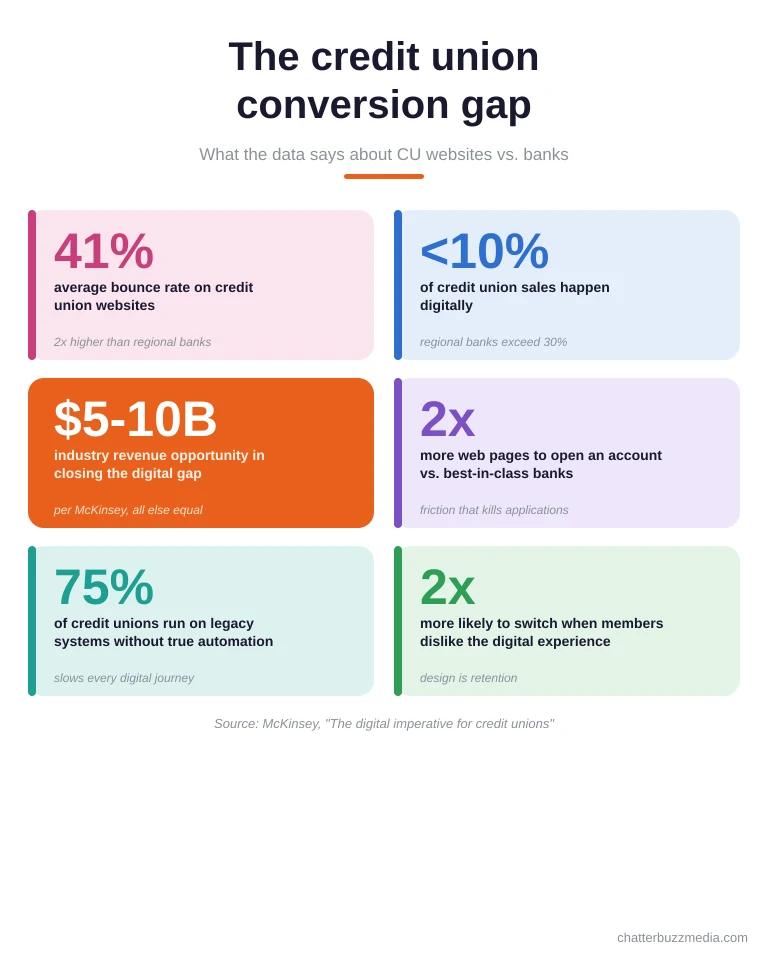
The stakes are measurable. McKinsey found that credit unions make less than 10% of their sales digitally while regional banks exceed 30%, a gap it valued at a $5 billion to $10 billion revenue opportunity for the industry.
Part of that gap is friction. The same research found opening an account at a credit union can take roughly twice as many web pages as at a best-in-class bank, and the average credit union site carries a 41% bounce rate.
Design also has to close a trust gap that banks do not face in the same way. A member choosing a credit union is often choosing a mission, so the site has to make “not-a-bank” tangible through plain language, local proof, and NCUA insurance signals, the same credibility that underpins effective credit union advertising.
Finally, credit unions operate under rules most websites ignore. Any page that quotes a dividend rate or APY falls under Truth in Savings, so the template itself has to carry disclosures correctly, a nuance that also shapes SEO for financial services. Keep those three jobs in mind, because every page below is designed to serve them.
Page 1: The homepage that routes, not just welcomes
The homepage’s job is not to say hello. It is to route each visitor to the one page that matches their intent in a single click, because most members arrive knowing roughly what they came to do.
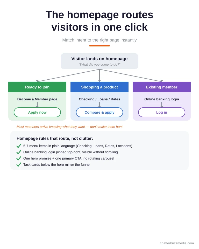
Start with navigation built around member tasks, not org charts. Limit the main menu to five to seven plain-language items like Checking, Loans, Rates, and Locations, and keep the online banking login fixed in the top right where returning members expect it.
The hero section should make one specific promise and pair it with one primary call to action. “Open an account in about 10 minutes” with a single “Become a Member” button beats a rotating carousel of slogans, a principle that applies to any responsive web design project.
Below the hero, use a small grid of task-oriented cards that mirror the funnel: join, apply for a loan, check rates, find a branch. This is the same discipline that drives a strong credit union landing page, applied to the one page everyone sees.
What to do: cap the menu at seven items, pin the login button, and make the hero CTA a verb a member can complete today. With the front door working, the next page has to make joining feel easy.
Page 2: The membership page that turns eligibility into applications
The membership, or “join,” page is where interest becomes an application, so it has to answer two questions fast: am I eligible, and how long will this take? Vague eligibility language is the single most common reason qualified visitors abandon.
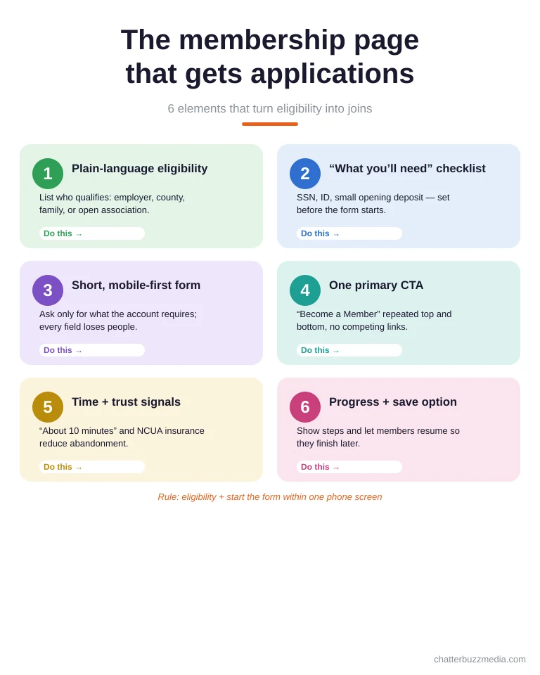
State the field of membership in plain terms up front. Replace “serving the community since 1956” with a short, scannable list of who qualifies, whether by employer, county, family, or a simple association anyone can join.
Set expectations before the form starts. A one-line “what you’ll need” checklist, Social Security number, ID, and a small opening deposit, removes the friction that makes people close the tab mid-application.
Keep the application itself short and mobile-first, because mobile is now the default research and signup device. Every extra field is a chance to lose someone, so ask only for what the account actually requires.
Rule: a visitor should understand eligibility and start the application without scrolling past one screen on their phone. Once they can join, your product pages have to show them what to join.
Page 3: Product pages that sell checking and savings
Account product pages convert when they lead with the member’s benefit and end with a single, obvious action. A weak product page lists features; a conversion-ready one answers “why this account, for me, right now.”
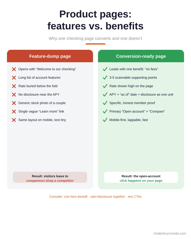
Open with the one reason the account exists, such as “no monthly fee, no minimum balance.” Then support it with a short benefit list drawn from the same elements that make a landing page convert, because skimmers decide in seconds whether the page is worth their attention.
Show the rate and the disclosure together. Any posted APY triggers Truth in Savings requirements, so the template should display the rate, the “as of” date, and the disclosure link as one component rather than scattered footnotes.
Close every product page with a matched pair of actions: a primary “Open this account” and a secondary “Compare accounts.” This mirrors the direct-and-indirect CTA structure that keeps both ready and researching visitors moving forward.
Consider: one hero benefit, three to five supporting points, rate-plus-disclosure as a unit, and two CTAs. Loans follow the same logic, with higher stakes and a longer decision.
Page 4: Loan pages built for the apply click
Loan pages carry the most buyer intent on the entire site, so their only job is to move a qualified visitor to “apply” with confidence. Auto, mortgage, personal, and home equity each deserve a dedicated page rather than one crowded “Loans” catch-all.
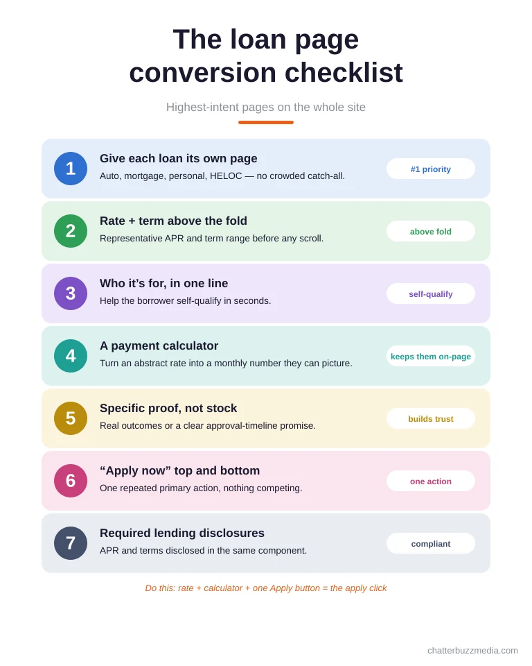
Lead with the decision information a borrower needs: representative rate, term range, and who the loan is for. Burying the rate below the fold forces people back to a search engine, where a competitor is one tap away.
Add a calculator to every loan page. A payment estimator turns an abstract rate into a monthly number the visitor can picture, and it keeps them engaged on your page instead of a third-party comparison site.
Use honest, specific proof instead of stock photography. A real member outcome or a clear approval-timeline promise does more for trust than a smiling couple, and removing generic filler is one of the most common fixes in a conversion rate audit.
Do this: rate and term above the fold, a calculator on the page, one “Apply now” button repeated top and bottom. Many of those applicants will check your rates page first, so it has to hold up.
Page 5: The rates page that stays compliant and converts
The rates page is both a conversion hub and your highest compliance-risk page, and it has to be designed for both at once. Members use it to comparison-shop, and regulators expect every number on it to carry the right disclosure.
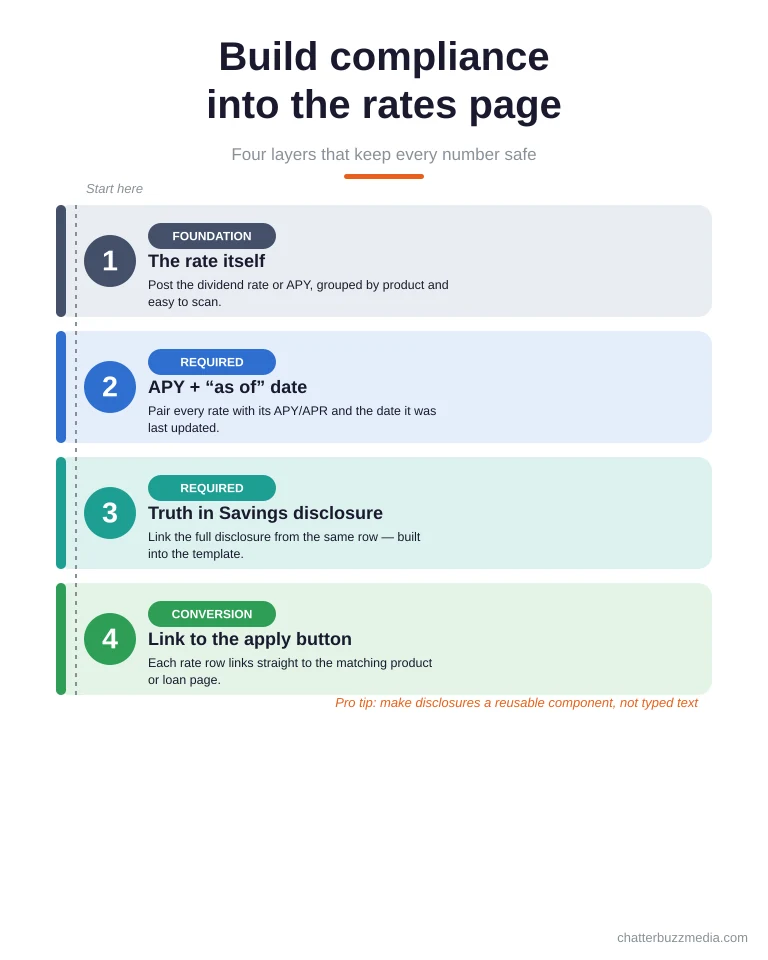
Build compliance into the layout in layers. Post the rate, pair it with the “as of” date and the APY or APR as required, and link the full Truth in Savings or lending disclosure from the same row, so accuracy does not depend on anyone remembering to add it.
Make the table scannable and current. Group rates by product, show the date they were last updated, and avoid stale numbers, because an out-of-date rate is both a trust problem and a compliance problem.
Turn the page into a launchpad. Every rate row should link directly to the matching product or loan page’s apply button, so a visitor who likes a number never has to hunt for how to act on it.
Pro tip: treat disclosures as a reusable template component, not hand-typed text, so compliance scales as rates change. With the sales pages set, members need an equally strong place to bank day to day.
Page 6: The digital banking page beneath the login button
The digital banking page looks like the simplest page on the site, a login box, but it sits on top of the most complex and most trust-sensitive work a credit union website does. What members see is a button; what converts them is everything underneath it.
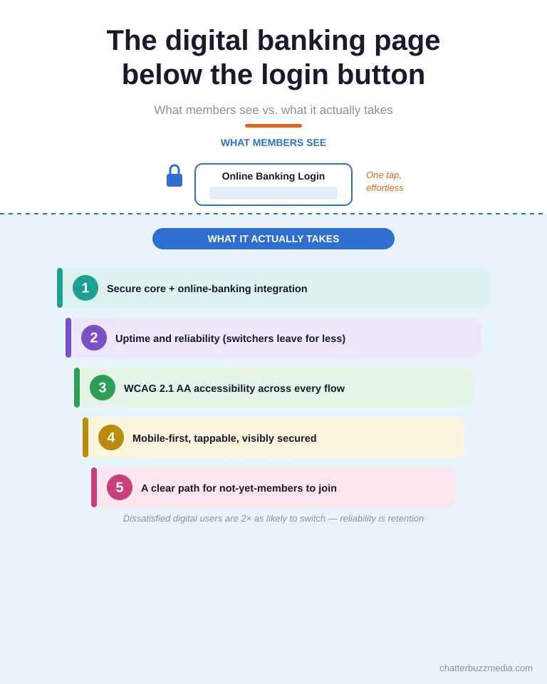
Above the surface, keep the experience effortless. The login should be reachable from every page, tappable on mobile, and visibly secured, because a confusing or sketchy-feeling login erodes trust with existing members and prospects alike.
Beneath the surface is the real work: secure integration with the core and online-banking provider, uptime, accessibility, and a clear path for someone who is not yet a member. Dissatisfied digital users are twice as likely to switch institutions, so reliability here is retention.
Give non-members a reason to stay on this page too. A short “not a member yet?” prompt that links to the join page turns a dead-end login screen into another on-ramp into the funnel.
What to do: make the visible login trivial, invest in the invisible reliability, and always offer the non-member a next step. Trust also has to be earned in the physical world, which is where the next pages come in.
Pages 7-9: The locator, about, and education pages that build trust
The final three pages convert by building credibility rather than asking for an application directly, and together they form the trust layer that makes the rest of the funnel believable. Local presence, mission, and expertise are exactly what separate a credit union from a faceless national bank.
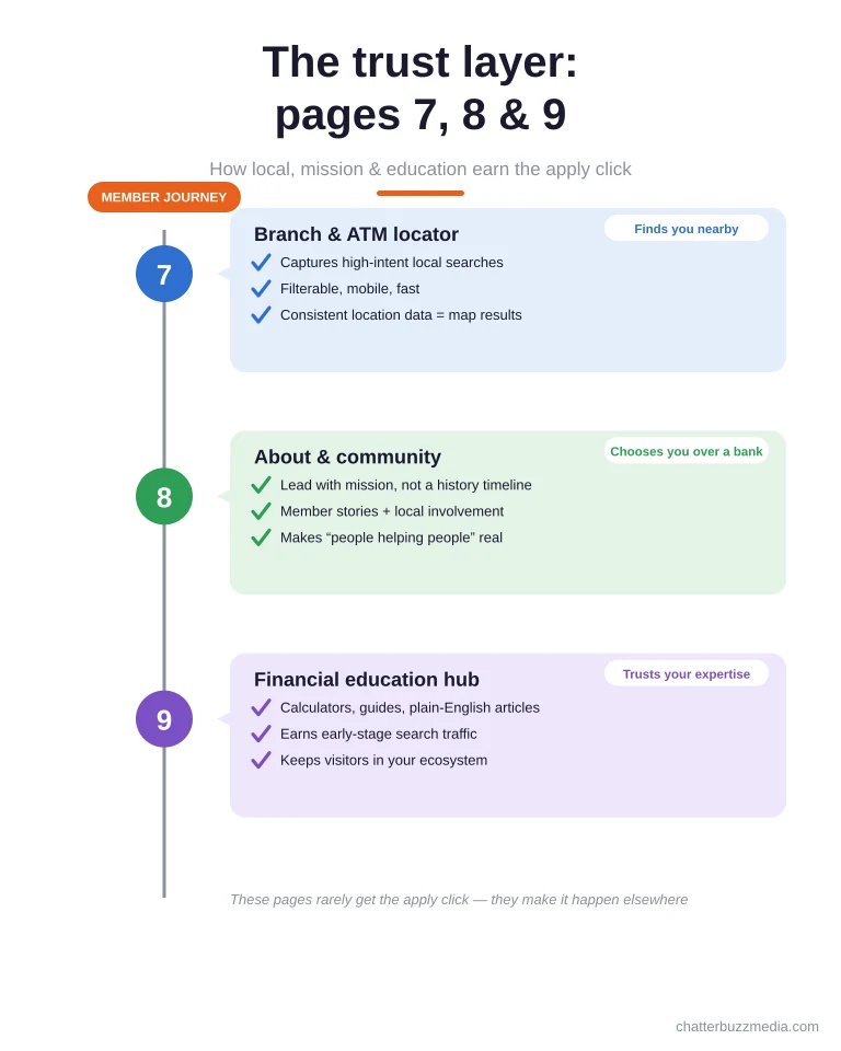
Page 7, the branch and ATM locator, captures high-intent local searches and reassures members that help is nearby. Make it filterable, mobile-friendly, and fast, and reinforce it with consistent location data so your branches show up in map results, the same discipline behind strong multi-location SEO for credit unions.
Page 8, the about and community page, is where you make “people helping people” concrete. Lead with mission, member stories, and local involvement rather than a history timeline, because that story is the reason a member chooses you over a bank.
Page 9, the financial education hub, earns search traffic and trust at the same time. Calculators, guides, and plain-English articles pull in visitors early in their decision and increasingly help you get surfaced in AI search for credit unions, a core move in any credit union marketing strategy.
These pages rarely get the “apply” click themselves, but they are what make the apply click happen elsewhere. The last step is making sure all nine work as one system.
How the nine pages work as one membership funnel
Individually these are just pages; together they are a funnel that carries a stranger from first click to funded account. The design goal is that no matter where a visitor lands, the site always shows them the next logical step toward joining.
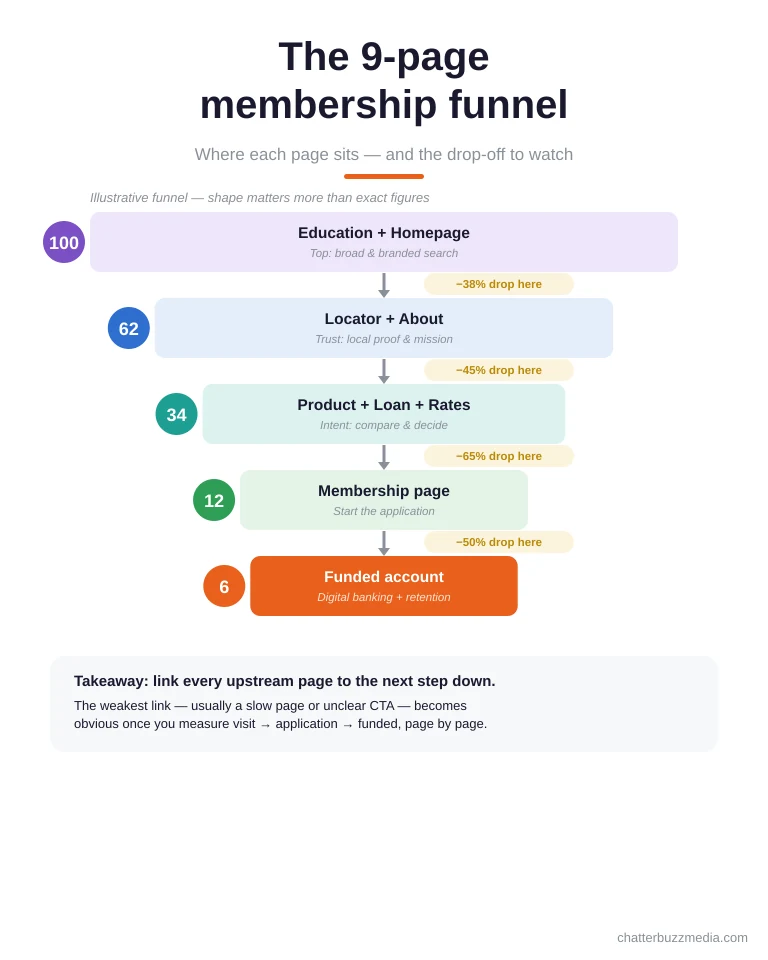
Education and the homepage sit at the top, catching broad and branded searches. The locator and about pages build trust in the middle, while product, loan, and rates pages carry commercial intent toward a decision.
Membership and digital banking sit at the bottom as the conversion and retention points. Every upstream page should link downstream, so a reader of an education article can reach a product page, then a rates comparison, then an application without a dead end.
This is where measurement matters. Track the path from landing page to started application to funded account, and the weak link, usually a slow page or an unclear CTA, becomes obvious and fixable through disciplined conversion rate optimization.
When the nine pages reference each other deliberately, the site stops being a collection of brochures and starts behaving like your best branch employee, always pointing members toward the next right action.
Frequently asked questions about credit union website design
1. 🔍 How many pages does a credit union website really need?
At minimum, the nine covered here: homepage, membership, product, loan, rates, digital banking, locator, about, and education. Larger credit unions expand each into clusters, but these nine form the complete path from first visit to funded membership.
2. 📊 Which pages convert the most new members?
Loan and membership pages carry the highest buyer intent and produce the most direct applications. Education and rates pages drive the traffic and comparison-shopping that feed those pages, so conversion depends on the whole funnel, not one page.
3. ⚡ How fast should a credit union website load?
Aim for under three seconds, because 40% of visitors leave a site that takes longer and every added second cuts conversions by roughly 4.4%. Speed is a conversion feature, especially on mobile, where most members now research and apply.
4. 🏦 What makes credit union web design different from bank web design?
Credit unions have to convert against larger competitors while staying compliant on every rate and product page, and they lead with mission rather than scale. Design has to make eligibility, trust, and “not-a-bank” values obvious in ways a national bank site does not.
5. 🤝 How do we keep rate and product pages compliant?
Treat disclosures as reusable template components so every posted APY or APR automatically carries its “as of” date and Truth in Savings or lending disclosure. Building compliance into the layout means accuracy does not depend on manual edits each time rates change.
6. 💰 How much does a credit union website cost?
Cost depends on scope, from a template refresh to a full custom build with core and online-banking integrations. The more useful question is cost per funded member, which a well-structured, conversion-focused site lowers over time regardless of the upfront investment.
7. 🚀 Is accessibility legally required for credit union websites?
Financial institutions are frequent targets of accessibility complaints, and WCAG 2.1 AA is the recognized standard courts and regulators reference. Beyond risk, accessible design widens your member base and improves usability for everyone.
8. 📈 How do we measure whether the website is working?
Track the funnel, not just traffic: sessions, started applications, completed applications, and funded accounts, page by page. The conversion rate from visit to application tells you far more than raw visits about whether the design is doing its job.
Turning nine pages into a growth engine
A credit union website earns members when every page answers one question and offers one clear next step, and when all nine reference each other as a single funnel. Principles alone do not convert; a deliberate page structure does.
Here is a simple action plan to put this to work:
- Audit your current nine pages. Map what you have against the list above and flag any page that lacks a single, obvious primary action.
- Fix friction first. Shorten the membership application, surface rates and logins, and get load time under three seconds before anything cosmetic.
- Build compliance into templates. Make rate, APY, and disclosure a reusable component so every product and loan page stays accurate as rates move.
- Connect the funnel and measure it. Link upstream pages to downstream actions and track visit-to-application conversion so you always know the weakest link.
If you want the broader strategy these pages plug into, the digital marketing guide for credit unions covers how design, SEO, and digital marketing for financial services work together to grow membership. Start with the nine pages, and your website becomes the hardest-working member of your growth team.

Noah Reed
Noah Reed is a growth marketing strategist at Chatter Buzz who helps credit unions and financial institutions grow membership, deposits, and loan volume through paid search, SEO, CRO, and full-funnel demand generation. Working within a Google Premier Partner team, he focuses on the metrics that actually move revenue, such as cost per acquired member, close rate, and lifetime value, rather than vanity metrics. Connect with Noah on LinkedIn.