
 321-341-2327
CRO Audit: 7 Conversion Killers Hiding on Your Website Right Now

Your traffic looks healthy. Your ad spend is climbing. Yet the leads and sales stay stubbornly flat — and the culprit is almost never the amount of traffic. It’s what happens after visitors arrive.
Across hundreds of conversion audits, the same seven problems surface on nearly every website, quietly bleeding revenue from pages that look perfectly fine on the surface. Most teams never spot them because they’re hunting for a big, obvious flaw when the real damage is a stack of small ones.
This guide walks through the seven conversion killers a CRO audit is designed to catch, the exact signals that expose each one, and the fastest fix for every problem. By the end, you’ll know precisely where your funnel is leaking before you spend another dollar driving people to it.
Key Takeaways
- A CRO audit finds why visitors don’t convert — it diagnoses friction across speed, messaging, CTAs, forms, trust, mobile, and funnel flow.
- Speed is the silent killer. Pages that load in one second convert up to three times higher than pages that take five.
- Clarity beats cleverness. If a visitor can’t explain what you offer in five seconds, your value proposition is costing you conversions.
- Every extra form field is a tax. Cutting fields and friction is one of the highest-ROI fixes an audit surfaces.
- Trust signals belong next to the decision — reviews, guarantees, and proof placed at the point of action lift conversions more than anywhere else.
- Prioritize by impact, not effort. Fix the killers touching the most traffic and the highest-value pages first.
What Is a CRO Audit?
A CRO audit is a structured review of your website that identifies exactly why visitors aren’t converting and what to fix first. It combines quantitative data — analytics, funnels, page speed — with qualitative evidence like heatmaps and session recordings to pinpoint friction.
Most sites don’t have a traffic problem. They have a conversion problem hiding in plain sight.
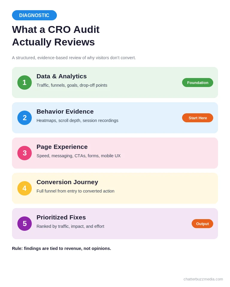
The average website converts just over 2% of visitors, according to Invesp’s benchmark data. That means 98 out of every 100 people leave without acting. A CRO audit exists to recover a slice of those lost visitors using traffic you’re already paying for.
Unlike a redesign, an audit doesn’t start with opinions about colors or layouts. It starts with evidence — where users hesitate, drop off, and abandon — and turns that evidence into a prioritized fix list.
Here’s what separates a real audit from a checklist skim: it connects behavior to money. A 12% drop-off on your cart page isn’t a UX note, it’s a revenue number. When you frame findings that way, the fixes prioritize themselves. Now let’s walk the seven killers that show up again and again.
Conversion Killer #1: Slow Page Speed That Drains Intent
Slow load times are the most expensive and most overlooked conversion killer, because they cost you visitors before they ever see your offer. Every second of delay compounds abandonment, and mobile users are the least patient of all.
The data is brutal. A Portent study found that a site loading in one second has a conversion rate roughly three times higher than one loading in five seconds.
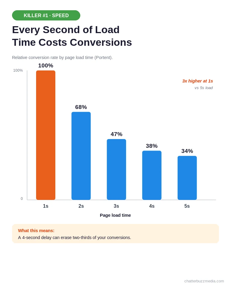
The audit signals are easy to read once you know where to look. Watch for a high bounce rate paired with low time-on-page, mobile conversion rates far below desktop, and a Core Web Vitals report flagging poor Largest Contentful Paint.
The most common culprits are almost always the same:
- Oversized, uncompressed images that were never resized for the web.
- Bloated third-party scripts — chat widgets, trackers, and pop-up tools stacking up.
- No caching or CDN, forcing every visitor to load everything from scratch.
Do this first: run the page through Google PageSpeed Insights, compress every image above 200KB, and defer non-critical scripts. Speed fixes are frequently the fastest ROI in any audit — and they lift every other section on this list. From here, we move from how fast the page loads to whether anyone understands it.
Conversion Killer #2: A Value Proposition Nobody Understands
If a visitor can’t tell what you do, who it’s for, and why it’s better within five seconds, your value proposition is killing conversions. Confusion is the fastest path to the back button, and clever headlines cause more of it than plain ones.
Most weak messaging isn’t wrong — it’s vague. “Innovative solutions for modern businesses” says nothing a competitor couldn’t also claim.
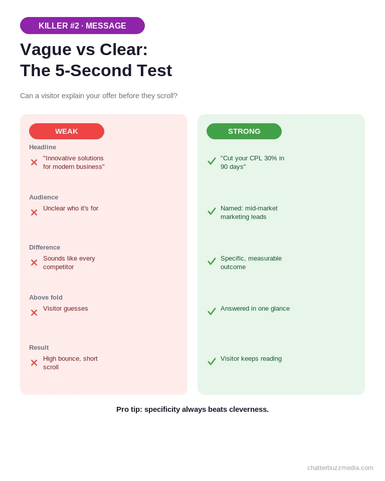
The signals show up in behavior. Look for high bounce rates on your highest-traffic landing pages, short scroll depth on the hero section, and heatmaps where visitors never make it past the fold.
A strong value proposition answers three questions above the fold: what is it, who is it for, and what makes it different. Specificity wins — “Cut your CPL 30% in 90 days” beats “grow your business” every time. Our breakdown of the StoryBrand framework for landing pages and how to write a one-liner both help sharpen the message.
Do this first: rewrite your hero headline to name a specific outcome and audience, then test it against your current version. A clear message doesn’t just lift this page — it sets up the next killer, because the best headline in the world fails if no one can find the button.
Conversion Killer #3: Weak, Buried, or Competing CTAs
Your call-to-action is where intent becomes action, so a CTA that’s unclear, hidden, or fighting for attention directly caps your conversion rate. The fix is rarely the button color — it’s clarity and focus.
The most common CTA failures share a pattern: too many choices and too little contrast.
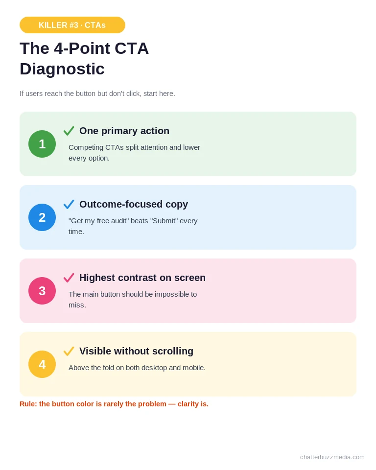
Run your key pages against this quick diagnostic:
- Is there one primary action per page? Competing CTAs split attention and lower every option’s performance.
- Does the button describe the outcome? “Get my free audit” beats “Submit” because it names the reward.
- Does it stand out visually? The primary CTA should be the highest-contrast element on the screen.
- Is it visible without scrolling? On both desktop and mobile, the main action should appear above the fold.
Heatmaps and click maps expose this fast — if users reach the CTA section but rarely click, the problem is the offer wording or the visual hierarchy, not the visitor. Our guide to landing page elements that convert covers CTA placement in depth.
Do this first: remove secondary CTAs from your highest-value page and give the primary action a high-contrast button with outcome-focused copy. Once people know where to click, the next question is how much you ask of them once they do.
Conversion Killer #4: Forms That Ask for Too Much
Every field you add to a form raises the odds a visitor abandons it, which makes form friction one of the highest-ROI fixes an audit uncovers. The goal is to ask for the minimum you need to start a conversation.
Long forms feel safe because more data seems better — but the data you never collect from people who quit is worse.
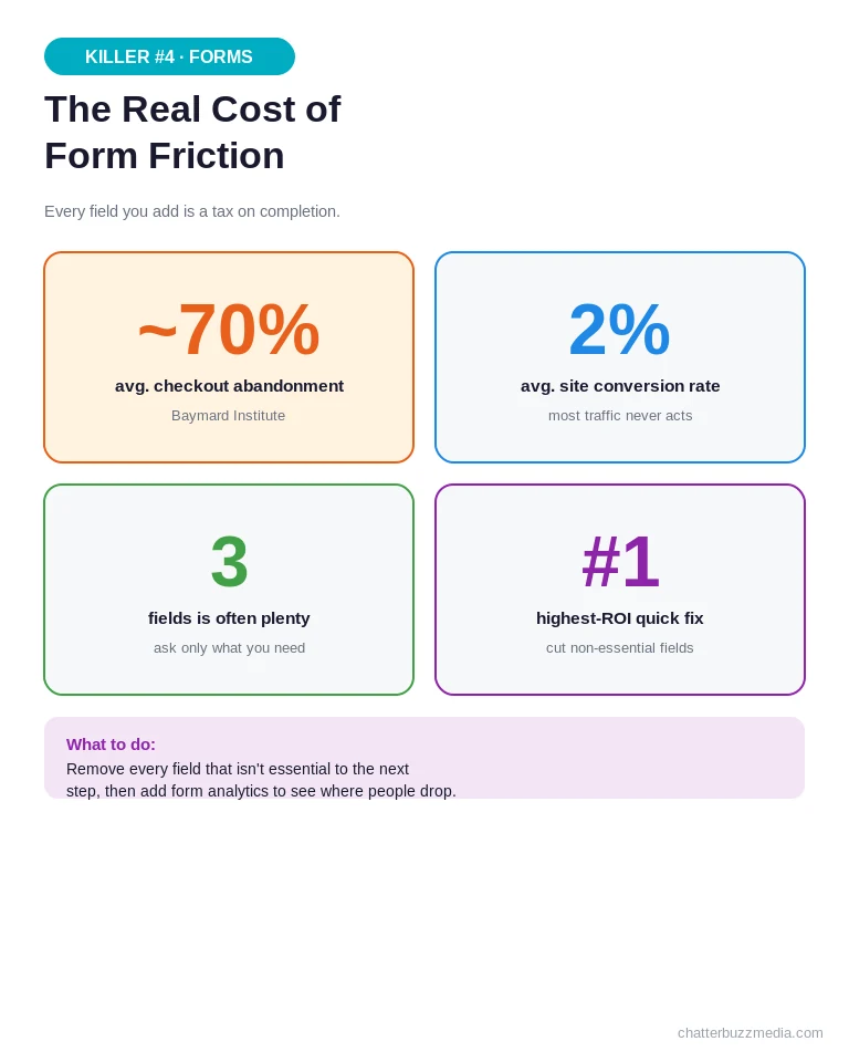
The Baymard Institute pegs the average checkout abandonment rate at roughly 70%, and a complicated or lengthy checkout is one of the leading reasons cited. The same principle applies to any lead form.
Audit your forms for these friction points:
- Unnecessary fields — every field you can remove or make optional reduces abandonment.
- No visible progress on multi-step forms, leaving users unsure how much is left.
- Vague labels or unclear errors that stall people mid-fill.
- Poor mobile usability, where tiny tap targets make completion painful.
For ecommerce specifically, our guide on reducing cart abandonment goes deeper on checkout friction.
Do this first: cut every form field that isn’t essential to the next step, and add form analytics to see exactly where people drop. Fewer fields today, more conversations tomorrow — which only matters if people trust you enough to submit at all.
Conversion Killer #5: Missing Trust Signals at the Moment of Decision
Visitors won’t convert if something feels risky, so missing or misplaced trust signals quietly suppress conversions right at the decision point. Proof works best when it sits next to the action, not buried on an “About” page.
Trust isn’t a single badge — it’s an accumulation of small reassurances at the exact moment doubt creeps in.
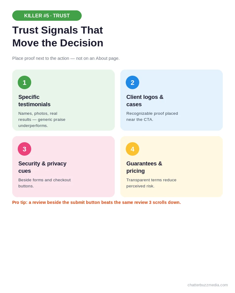
The trust signals that move conversions the most include:
- Specific testimonials with names, photos, and real results — generic praise underperforms.
- Recognizable client logos or case-study proof near the CTA.
- Security and privacy cues next to forms and checkout buttons.
- Transparent pricing, guarantees, or refund policies that reduce perceived risk.
Placement is everything. A five-star review three scrolls below the form does nothing; the same review beside the submit button changes the decision. Our work on addressing customer pain points pairs well with strong proof.
Do this first: place your two strongest, most specific testimonials directly beside your primary conversion point. With trust in place, the last structural question is whether any of this even works on the device most of your visitors are using.
Conversion Killer #6: A Broken Mobile Experience
Mobile now drives the majority of web traffic, so a page that works on desktop but frustrates on mobile is silently killing most of your conversions. Mobile friction — not desktop polish — is where the real losses hide.
The trap is auditing on a big screen. Everything looks fine on a laptop while the mobile experience quietly fails.
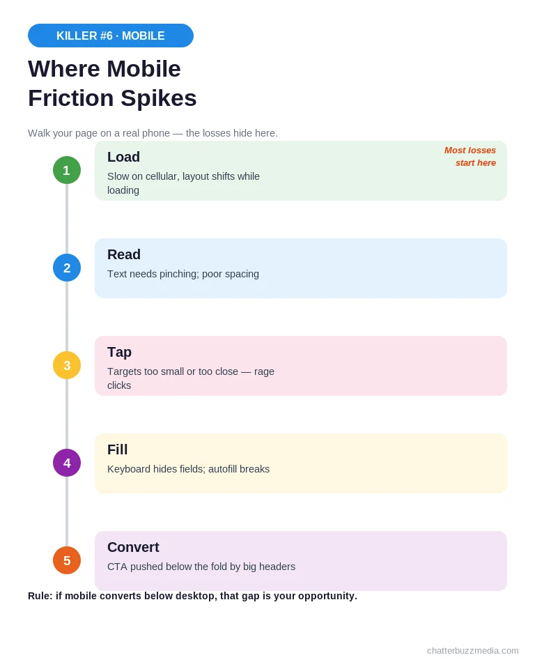
Walk your key pages on an actual phone and watch for the moments friction spikes across the mobile journey:
- Tap targets too small or too close, causing mis-taps and rage clicks.
- Text that requires pinching to read, or layouts that shift while loading.
- Forms that fight the keyboard, hiding fields or breaking autofill.
- CTAs pushed below the fold by oversized hero images and headers.
Google’s research shows bounce probability climbs sharply as mobile load time grows, and the same holds for usability friction. If mobile converts far below desktop, that gap is your opportunity. Our post on why landing pages invite users to leave covers more of these traps.
Do this first: test your top three pages on a real mid-range phone, fix tap targets and above-the-fold CTA visibility, and re-check load speed on cellular. Once each page performs, the final killer is what happens between pages.
Conversion Killer #7: Leaky Funnels and Distraction Overload
Even strong pages lose conversions when the path between them leaks — distractions, dead ends, and unnecessary steps drain intent as visitors move toward the goal. The funnel, not the page, is often where the biggest drop hides.
A leaky funnel is death by a thousand exits: every extra click, competing link, or confusing step sheds a few more people.
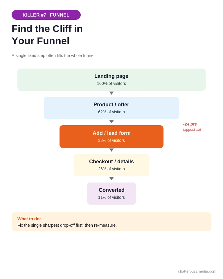
Map the actual path from entry to conversion and hunt for these leaks:
- High drop-off between two specific steps — the sharpest cliff is your first fix.
- Distractions competing with the goal, like nav menus and outbound links on a conversion page.
- Unnecessary steps that add clicks without adding value.
- Dead clicks where users tap elements that aren’t links, signaling confusion.
Funnel analysis in your analytics tool shows exactly where the cliff is — and a single fixed step often lifts the whole funnel. Our comparison of PPC versus CRO explains why plugging leaks beats buying more traffic.
Do this first: build a funnel report for your primary conversion path, find the single biggest drop-off, and remove one point of friction from that step. Now that you’ve met all seven, let’s turn them into an audit you can run this week.
How to Run Your Own CRO Audit and Prioritize Fixes
Run your CRO audit in a fixed order — gather data, review each killer, then prioritize fixes by impact — so you attack the problems costing the most revenue first. A structured pass beats random tweaks every time.
The mistake most teams make is fixing what’s easy instead of what matters.
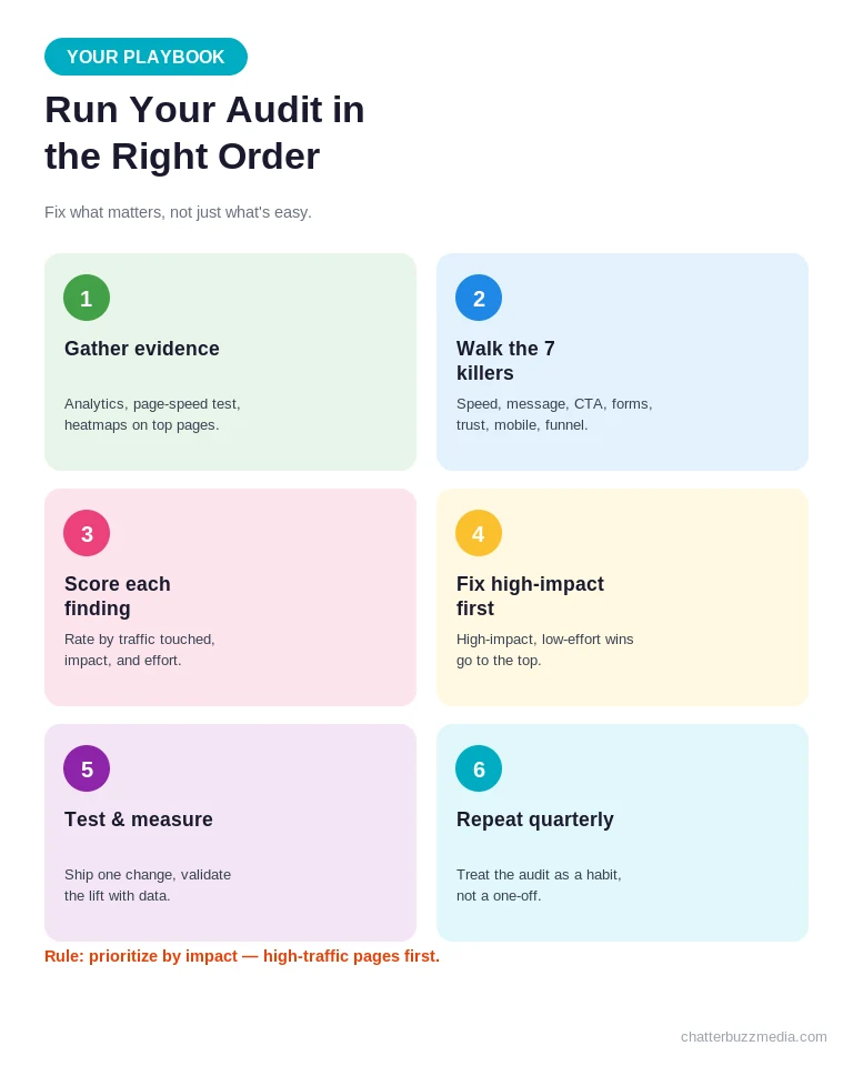
Prioritize every finding by three factors: how much traffic it touches, how much it lifts conversions, and how hard it is to implement. High-traffic, high-impact, low-effort fixes go first. Track results against clear marketing KPIs so you can prove the lift, and treat the audit as a recurring habit rather than a one-time project.
If you’d rather have experts run the full diagnostic for you, our conversion rate optimization services and free digital marketing audit are built to surface exactly these killers. You can also explore more playbooks in our marketing resources library.
Frequently Asked Questions About CRO Audits
1. 🔍 What is a CRO audit and what does it include?
A CRO audit is a structured review of your website that identifies why visitors aren’t converting. It includes analysis of page speed, messaging, CTAs, forms, trust signals, mobile experience, and the full conversion funnel, combining analytics data with heatmaps and session recordings to produce a prioritized list of fixes.
2. 📊 How long does a conversion rate optimization audit take?
A focused audit of your highest-value pages can be completed in one to two weeks. A comprehensive audit covering an entire website, multiple funnels, and behavioral data typically takes three to four weeks, depending on the complexity of the site and the depth of tracking already in place.
3. ⚡ How much does a CRO audit cost?
Costs vary with site size and depth. A focused website audit for a small business often runs from $1,000 to $5,000, while larger ecommerce or enterprise audits with behavioral analysis and funnel testing can range from $10,000 to $50,000 or more. Many teams start with a free or low-cost diagnostic before committing to a full engagement.
4. 🏦 How often should I run a website conversion audit?
Run a full audit at least once or twice a year, and always before scaling paid traffic, after a redesign, or when conversion rates drop. Your highest-value pages and funnels deserve more frequent review, since small changes in traffic quality or user behavior can quietly erode performance.
5. 🤝 What tools do I need for a CRO audit?
At minimum you need an analytics platform for traffic and funnel data, a heatmap and session-recording tool to see behavior, a page-speed tester, and a form-analytics tool. A/B testing software validates your fixes. The exact stack matters less than combining quantitative data with qualitative evidence.
6. 💰 Is a CRO audit better than spending more on ads?
For most sites with existing traffic, fixing conversion leaks delivers a higher return than buying more traffic. If your page converts at 2%, doubling it to 4% doubles revenue from the same ad spend. An audit finds those leaks first, so every future dollar of traffic works harder.
7. 🚀 What’s the difference between a CRO audit and a redesign?
A redesign starts with opinions about how a site should look and rebuilds broadly. A CRO audit starts with evidence about how users actually behave and recommends targeted, testable changes. Audits are faster, cheaper, and lower-risk because each fix is prioritized by measured impact rather than aesthetic preference.
8. 📈 How quickly will I see results from CRO fixes?
Technical fixes like page speed can show impact within days. Messaging, CTA, and form changes usually need one to two weeks of traffic to validate through testing. The compounding effect builds over months as you work down the prioritized list and each improvement stacks on the last.
Turn Your Audit Findings Into Revenue
The seven killers in this guide share one trait: they hide in plain sight on pages that look completely fine. That’s exactly why traffic keeps climbing while conversions stay flat — and exactly why an audit pays for itself.
Here’s your action plan to start recovering lost conversions this week:
- Gather your evidence. Pull analytics, run a page-speed test, and set up a heatmap on your two highest-value pages.
- Walk the seven killers. Review speed, messaging, CTAs, forms, trust, mobile, and funnel flow one at a time, noting every issue.
- Prioritize by impact. Rank fixes by traffic touched, conversion lift, and effort — then tackle the high-impact, low-effort wins first.
- Fix, test, and repeat. Ship one change at a time, measure the lift, and make the audit a recurring quarterly habit.
You don’t need more traffic to grow — you need more of the traffic you already have to convert. If you want a professional set of eyes on your funnel, start with a free digital marketing audit and see which killers are hiding on your site right now.

Victoria Wallace
Victoria Wallace is a senior content strategist and marketing writer with 30+ years of experience helping more than 200 brands translate complex business goals into clear, conversion-focused content. Her background spans paid media, marketing strategy, go-to-market planning, brand positioning, and full-funnel campaign development, giving her a deep understanding of how SEO content connects to real business growth.