
 321-236-2899
Landing Page Optimization: 12 Elements That Convert
Most landing pages don’t fail because of bad design. They fail because a handful of high-leverage decisions were made wrong, and no one measured the cost.
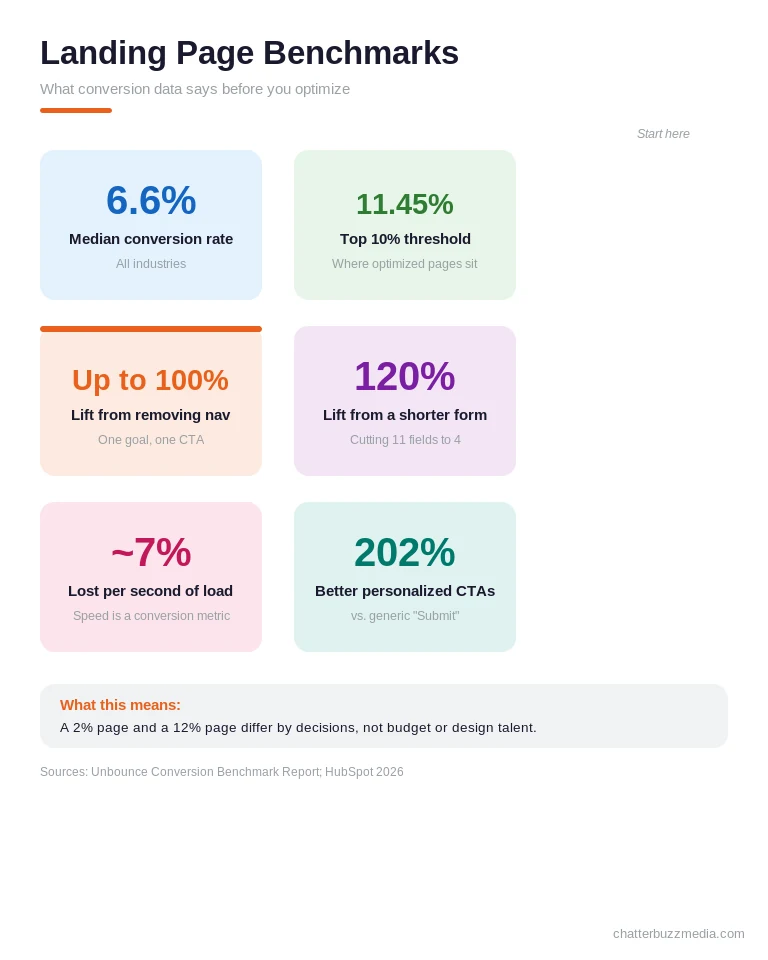
The median landing page converts at 6.6%, while the top 10% convert at 11.45% or higher (Unbounce Conversion Benchmark Report). That gap isn’t talent or budget. It’s structure.
This guide breaks down landing page optimization into 12 concrete elements, each backed by real conversion data, plus 2026 benchmarks by industry, a step-by-step testing process, and the mistakes that quietly drain conversions. By the end, you’ll know exactly which change to make first on your own page.
Key Takeaways
- Landing page optimization is structured, not cosmetic. The difference between a 2% and a 12% page is 12 specific decisions, not a prettier layout.
- Removing navigation can lift conversions by up to 100%. A homepage serves 20 goals; a landing page should serve exactly one.
- Speed is a conversion metric, not just an SEO one. Every extra second of load time costs roughly 7% in conversions.
- Shorter forms convert dramatically better. Cutting fields from 11 to 4 can increase completions by 120%.
- Benchmarks depend on traffic, not vanity averages. B2B pages average 13.3%; SaaS averages 3.8% — always compare against your own traffic type.
What Landing Page Optimization Actually Means
Landing page optimization is the process of systematically improving a single, standalone page so that a higher percentage of visitors complete one specific action. That action might be booking a demo, downloading a guide, requesting a quote, or starting a trial.
It matters because a landing page has a fundamentally different job than a homepage. Your homepage serves five audiences and twenty goals, while a landing page serves one audience with one goal.
That focus is what makes a high conversion rate possible in the first place. Companies with 10–15 landing pages generate 55% more leads than those with fewer than 10, and sites with 40+ pages see up to 500% more leads (HubSpot Marketing Statistics).
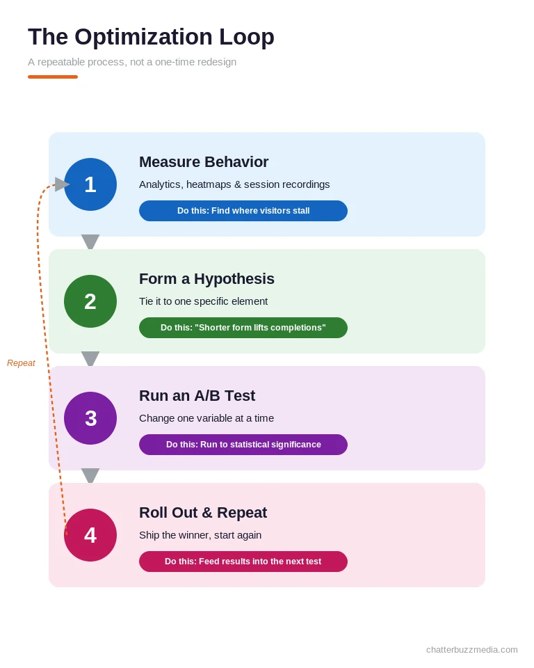
Optimization isn’t a one-time redesign. It’s a repeatable loop of measuring behavior, forming a hypothesis, testing a change, and keeping what wins.
The financial logic is what makes it so compelling. Because you’re improving conversion on traffic you already pay for, every point of lift drops straight to the bottom line without spending an extra dollar on ads.
The numbers below show why the discipline pays off — and what “good” actually looks like before you start.
The 12 High-Converting Landing Page Elements
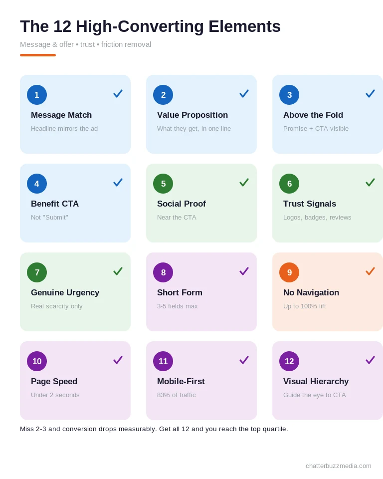
Every high-converting landing page shares the same 12 elements, and missing even two or three drops your conversion rate measurably. These aren’t style preferences — each one is tied to a documented lift.
Think of them as a checklist rather than a menu. Get all twelve right and you move into the top quartile of pages in your industry.
They also fall into three natural groups. Elements one through four shape the message and offer, five through seven build trust, and eight through twelve remove friction from the experience.
1. Message Match Between Ad and Page
Your landing page headline should echo the exact promise of the ad or link that sent the visitor there. If the ad says “Free Marketing Audit for Manufacturers,” the page headline should say the same — not “Welcome to Our Agency.”
Aligning the headline to the traffic source typically lifts conversions by 15–25%. For paid campaigns, dynamic text replacement can insert the searched keyword directly into the headline for near-perfect match.
Roughly 40% of the pages audited by conversion specialists still fail this basic test. It’s the cheapest lift on this entire list, because it costs nothing but attention to fix.
Message match extends beyond the headline to the imagery and offer as well. When your paid search campaigns promise a specific result, the entire page should reinforce that exact promise from the first pixel to the form.
2. A Value Proposition You Can Read in One Breath
A visitor should understand what you offer, who it’s for, and why it’s different in the time it takes to read one sentence. If your value proposition needs a paragraph, it’s too complex for a landing page.
A reliable formula is [what you get] + [who it’s for] + [why it’s different]. Nailing the offer matters more than clever copy — a strong irresistible offer will outperform beautiful design every time.
A proven way to sharpen the message is to frame the visitor as the hero and your offer as the guide. The StoryBrand framework applied to landing pages gives you a repeatable structure for value propositions that resonate instantly.
3. A Clean Above-the-Fold Layout
The headline, value proposition, and primary call to action should all be visible without scrolling. On mobile, that means a tight hero section — no oversized background image pushing the CTA out of view.
This doesn’t mean everything belongs above the fold. It means the core promise and the action must be immediately visible, while everything below simply supports the decision.
A useful test is the five-second glance: show the top of your page to someone unfamiliar with it and ask what you do and what they should do next. If they can’t answer both, your above-the-fold layout needs work before anything else does.
4. A Benefit-Driven Call to Action
Your CTA should tell visitors what they get, not what they have to do. “Get My Free Audit” outperforms “Submit,” which reduces conversions by roughly 3% compared to benefit-oriented copy.
Personalized CTAs that mirror the visitor’s intent convert up to 202% better than generic ones. The same principle drives results in PPC landing pages built for paid traffic, where the CTA must match the campaign’s exact promise.
Keep the primary CTA consistent everywhere it appears on the page. Offering “Book a Demo” at the top and “Contact Sales” at the bottom splits intent and quietly lowers completion, so repeat one action verbatim rather than inventing variations.
5. Social Proof Placed Near the CTA
Testimonials at the top build general awareness, but proof placed within one scroll of the CTA overcomes last-minute hesitation. Timing matters more than volume.
The strongest proof mirrors the visitor’s own situation. A quote from someone in the same industry, role, or company size lands harder than a famous logo, because prospects convert when they see people like themselves succeed.
Testimonials can boost conversions by up to 34%, and specific quotes with real names and outcomes (“We generated 40% more leads in month one”) beat vague praise. If you’re not sure why visitors leave, review the signals that quietly invite users to abandon a page.
Well-written proof also carries the story forward instead of interrupting it. Weaving testimonials into your storytelling copy makes them feel like evidence rather than decoration.
6. Trust Signals That Reduce Perceived Risk
Client logos, security badges, certifications, and review counts lower the emotional cost of converting. Place them near the form, where hesitation peaks.
For B2B pages, recognizable client names outperform generic “trusted by 1,000+ companies” claims. If visitors won’t recognize the names, show the count instead.
Match the trust signal to the specific objection it answers. Security badges calm privacy concerns near the form, while industry certifications reassure buyers in regulated fields — placing the right proof at the right moment beats stacking every badge you own.
7. Genuine Urgency (Never Fake Scarcity)
Countdown timers and limited availability work when the constraint is real, like cohort-based programs or seasonal offers. Manufactured urgency converts once and erodes trust forever.
“Only 3 spots left” on a demo page with unlimited capacity is a lie visitors eventually catch. Real scarcity converts and retains; fake scarcity does neither.
When you don’t have a natural deadline, lean on value-based motivation instead of manufactured pressure. Reminding visitors what they lose by waiting — momentum, results, a lower price locked in today — creates honest urgency without eroding trust.
8. A Short Form (3–5 Fields)
Reducing form fields from 11 to 4 can increase conversions by 120%, because every extra field is a new point of friction. For most lead-gen pages, name, email, and one qualifying question is enough.
When you genuinely need more data, use a multi-step form that starts with low-commitment fields. Visitors who complete step one are far more likely to finish the rest.
Field type matters as much as field count. Asking for a phone number depresses completions more than asking for a job title, because the perceived privacy cost is higher — so request only what you truly need at this stage.
9. No Navigation or Competing Links
Removing navigation from a landing page can increase conversions by up to 100%, because every off-page link is a funnel leak. A homepage has 20+ links; a high-converting landing page has one — the CTA.
If visitors need to explore, use anchor links that scroll within the page rather than send them away. This single change is often the fastest win in any conversion rate optimization effort.
That includes the logo in your header, which most visitors instinctively click to escape. On a dedicated landing page, make the logo non-clickable or drop the full header entirely so there’s no exit hatch from the funnel.
10. Page Speed Under Two Seconds
Every additional second of load time costs approximately 7% in conversions, and pages loading in one second convert roughly 3x better than those loading in five. Speed is a conversion signal, not just a ranking factor.
The impact is sharpest on paid traffic, where you’ve already spent money to earn the click. A slow page effectively throws away a percentage of every ad dollar before the visitor even sees your offer.
Google’s own research found that as page load time goes from one to three seconds, the probability of a bounce increases 32% (Think with Google). Speed isn’t a nice-to-have; it’s the gatekeeper for every other element on this list.
Compress images, lazy-load below-the-fold content, and minimize JavaScript to hit Core Web Vitals targets. A slow page loses visitors before they ever read your offer.
Speed problems often trace back to the underlying build rather than the content. Investing in clean website design and development pays for itself when a fast foundation protects every conversion downstream.
11. Mobile-First Design
Mobile accounts for roughly 83% of landing page traffic but converts at about half the desktop rate — a design problem, not an intent problem. Most pages are built on a large monitor and “made responsive” as an afterthought.
Mobile-first means thumb-friendly tap targets (44×44px minimum), forms that never require horizontal scrolling, and a CTA visible without scrolling past the fold. Design for the phone first, then adapt upward.
Test your page on an actual phone over a cellular connection, not just a resized browser window. The gap between a desktop preview and a real handheld experience is where a surprising share of mobile conversions quietly disappears.
12. Visual Hierarchy That Guides the Eye
The visitor’s eye should follow a deliberate path: headline, supporting text, visual, social proof, then CTA. If everything has equal visual weight, attention scatters and conversions fall.
Use size, color contrast, and whitespace so the CTA is the most prominent element on the page. Not the logo, not the hero image — the action.
Contrast is the most underused lever here. A CTA button in a color that appears nowhere else on the page draws the eye almost involuntarily, which is why the highest-converting buttons rarely match the brand’s dominant color.
These twelve elements aren’t independent; they compound, which is why the benchmarks below vary so widely by industry and execution.
Landing Page Conversion Rates by Industry (2026 Benchmarks)
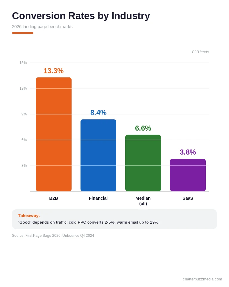
A “good” conversion rate depends entirely on your industry and traffic source, not a single universal number. Benchmarking against the wrong average leads teams to celebrate mediocrity or panic over strong results.
Across all industries, the median sits at 6.6%, but the spread is dramatic. B2B pages lead at 13.3% (First Page Sage, 2026), while SaaS averages just 3.8% and financial services lands around 8.4%.
Traffic type shifts the math even further. Cold PPC traffic often converts at 2–5%, while warm email traffic can exceed 19% on the same offer.
Use these numbers as a directional target, then focus on beating your own baseline month over month. Understanding the difference between paying for traffic versus optimizing what you already have is central to setting realistic goals.
Regulated industries add another layer, because compliance requirements shape both copy and design. A credit union landing page built for CRO, for example, has to balance disclosures and trust signals against the same conversion principles every other page follows.
The takeaway isn’t to chase a specific percentage — it’s to know your starting point cold. Only then can you tell whether a change actually moved the needle or simply reshuffled the same visitors.
How to Optimize an Existing Landing Page, Step by Step
The fastest way to improve an existing page is to follow a disciplined loop rather than redesigning on instinct. Optimization is a process of evidence, not opinion.
Start by defining the single conversion goal and confirming your traffic source, because those two inputs shape every decision that follows. Then work through the steps below in order.
First, measure current behavior with analytics, heatmaps, and session recordings to see where visitors hesitate or drop off. You can’t fix friction you can’t see.
Second, form one clear hypothesis tied to a specific element, such as “shortening the form will lift completions.” Vague goals produce vague results.
Third, run a controlled A/B test that changes only one variable at a time and runs to statistical significance before you declare a winner. Testing two things at once tells you nothing.
Fourth, roll out the winner and repeat, treating every test as input for the next hypothesis. This is the same evidence-driven discipline behind a broader marketing audit, applied to a single page.
Prioritize your tests by expected impact and effort rather than personal preference. A one-line CTA change that takes an hour can outperform a full redesign that takes a month, so sequence the quick, high-impact wins first.
If you’d rather start with an outside read on where your pages leak, a structured growth audit can surface the biggest opportunities before you commit engineering time. Either way, the loop stays the same: measure, hypothesize, test, repeat.
Landing Page Mistakes That Quietly Kill Conversions
Most conversion losses come from a short list of recurring mistakes rather than one catastrophic flaw. Each one feels minor in isolation, but they compound into a page that underperforms its potential.
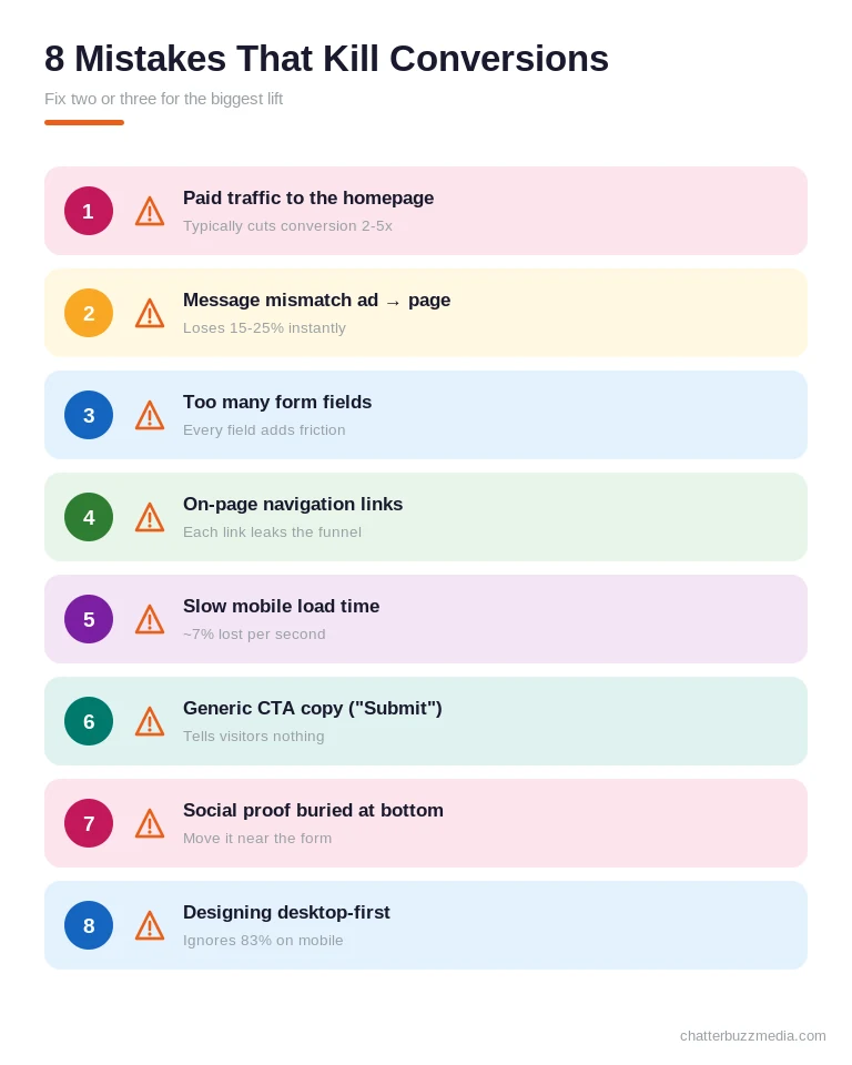
The most expensive mistake is sending paid traffic to your homepage instead of a dedicated page, which typically cuts conversion by 2–5x. Your homepage was never built to convert a single audience.
Close behind is message mismatch between the ad and the page, which can cost 15–25% of conversions instantly. When the promise changes on arrival, trust evaporates.
Other frequent offenders include forms with too many fields, on-page navigation links that leak the funnel, slow mobile load times, and generic CTA copy like “Submit.” Burying social proof at the bottom of the page — far from where hesitation actually happens — is another silent killer.
Finally, designing for desktop first ignores the 83% of traffic arriving on mobile. Fixing even two or three of these often produces the single biggest lift on a struggling page.
The pattern behind all of these is the same: each mistake adds friction or dilutes focus. Landing pages don’t reward “more” — they reward removing everything that doesn’t serve the single conversion goal.
Landing Page Optimization Tools Worth Using
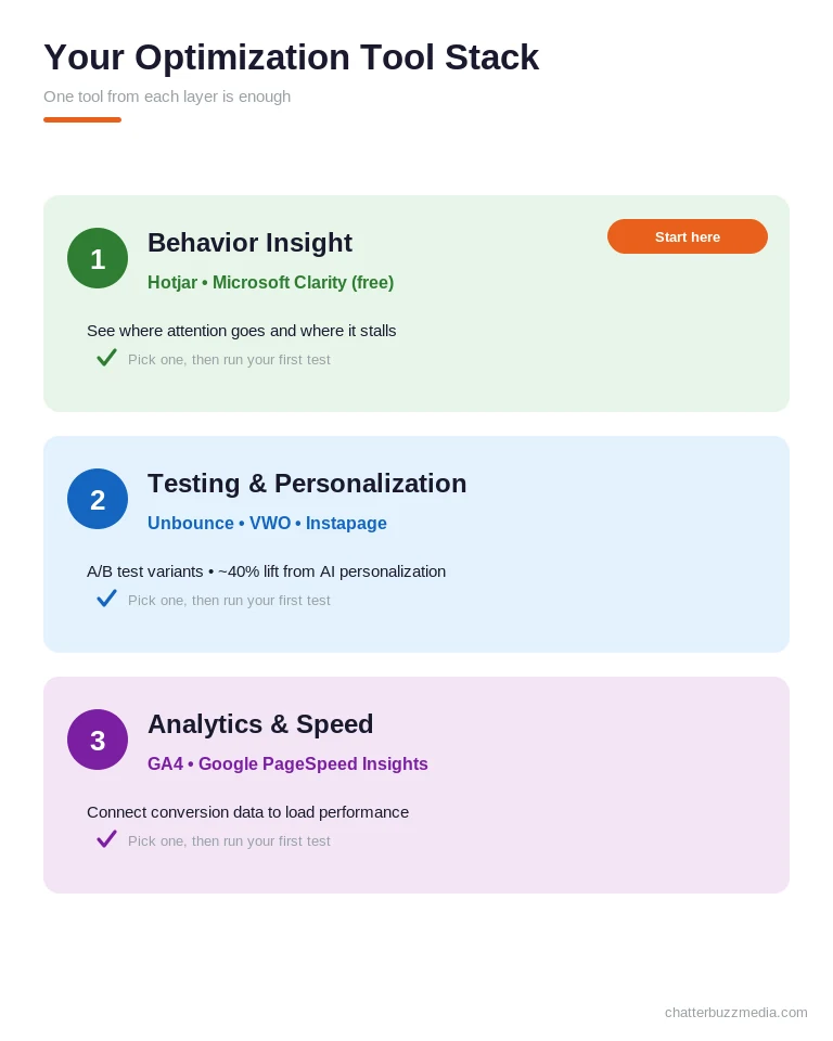
The right tools turn optimization from guesswork into evidence by showing you what visitors actually do. You don’t need all of them — you need one from each category below.
For behavior insight, heatmap and session-recording tools like Hotjar or Microsoft Clarity reveal where attention goes and where it stalls. Clarity is free, which makes it an easy starting point.
Watch ten real session recordings before you touch anything. You’ll almost always spot a confusing element, a dead scroll zone, or a form field people abandon — insights no dashboard number alone will surface.
For testing and personalization, platforms such as Unbounce, VWO, and Instapage handle A/B tests and can route traffic to winning variants automatically. AI-powered personalization on these tools delivers roughly 40% conversion lifts when the fundamentals are already solid.
For analytics and speed, pair GA4 with Google’s PageSpeed Insights to connect conversion data to load performance. Getting your tracking right also depends on clean measurement, which is where a properly configured server-side conversions setup earns its keep.
Start with one behavior tool and one testing tool before adding anything else. Most teams drown in dashboards long before they run their first meaningful experiment, and unused data changes nothing.
Remember that no tool fixes a weak offer or a confusing value proposition. Get the twelve fundamentals right first, then layer tooling and AI on top for compounding gains.
Frequently Asked Questions
1. 🔍 What is a good landing page conversion rate?
The median across all industries is 6.6%, and anything above 10% puts you in the top quartile. B2B pages average 13.3% while SaaS averages 3.8%, so always benchmark against your own industry and traffic source rather than a single universal number.
2. 📊 What are the most important landing page elements?
The highest-leverage elements are message match, a one-sentence value proposition, a short form, a benefit-driven CTA, and fast load speed. These five typically move the needle most, but all twelve elements compound when used together.
3. ⚡ How does page speed affect conversions?
Every additional second of load time costs roughly 7% in conversions, and one-second pages convert about 3x better than five-second pages. Compress images, minimize JavaScript, and lazy-load below-the-fold content to stay under two seconds.
4. 🏦 How many form fields should a landing page have?
Three to five fields is the sweet spot, since reducing fields from 11 to 4 can increase conversions by 120%. When you need more information, use a multi-step form that begins with low-commitment fields like name and email.
5. 🤝 Should a landing page have navigation?
No — removing navigation can increase conversions by up to 100% because every off-page link is a potential funnel leak. If visitors need to explore, use anchor links that scroll within the same page instead.
6. 💰 Does video improve landing page conversions?
Video can boost conversions by up to 86%, but placement and length matter more than simply having one. Short 60–90 second demos near the CTA perform best, and video should always be click-to-play rather than autoplay on mobile.
7. 🚀 How is AI changing landing page optimization in 2026?
AI-powered personalization dynamically adjusts headlines, offers, and CTAs by visitor source and behavior, delivering roughly 40% conversion lifts when implemented well. It’s excellent for generating test variants at speed, but it can’t fix a bad offer or a confusing value proposition.
8. 📈 How often should I test my landing pages?
Treat optimization as a continuous loop rather than a one-time project, running a new test as soon as the previous one reaches significance. Prioritize tests by expected impact and effort so you always work on the highest-value change next.
Turning 12 Elements Into a Higher-Converting Page
Landing page optimization rewards precision, not perfection. The pages that convert at 10%+ aren’t prettier — they match visitor intent, remove distractions, and make the next step obvious.
You don’t have to fix all twelve elements at once. Start with the highest-leverage changes and let the data guide the rest.
The compounding nature of these elements is the real opportunity. Fixing your form might add two points, tightening your headline another two, and speeding up the page another two — and together they can move a page from average to top-quartile in a single quarter.
Here’s a simple four-step action plan to put this guide to work:
- Audit against the 12 elements. Score your current page and flag every element you’re missing or executing weakly.
- Fix the funnel leaks first. Remove navigation, shorten the form, and align your headline to your traffic source before anything else.
- Measure, then test one change at a time. Use heatmaps and A/B tests to validate each hypothesis to statistical significance.
- Roll out winners and repeat. Treat every result as the starting point for your next test.
Want to see how a data-led approach maps to your specific traffic and offer? Explore more conversion rate optimization strategies or browse the full library of marketing resource guides to plan your next round of improvements.

Victoria Wallace
Victoria Wallace is a senior content strategist and marketing writer with 30+ years of experience helping more than 200 brands translate complex business goals into clear, conversion-focused content. Her background spans paid media, marketing strategy, go-to-market planning, brand positioning, and full-funnel campaign development, giving her a deep understanding of how SEO content connects to real business growth.