Data Visualization: The Importance of Tools Like Google Data Studio
When you’re involved in digital marketing, you can quickly accumulate volumes of data without knowing what to do with it all. What do those numbers and statistics mean?
Tools such as Google Analytics and Google Ads can give you more data to work with. That certainly doesn’t help when all you want to do is receive a simple, precise report on your company. That is why data visualization tools exist to help you present your data in a dynamic format.
What is Data Visualization?
Data visualization takes all of your business data and presents it as a simple visual aid.
The main idea is to take all raw information and chunks of data from various places, and assemble them together. Then, use that collected data to create highly informative views. Those views can then give you an overview of the entire business or organization metrics. That makes it easier to make profitable, long-term business decisions more accurately.
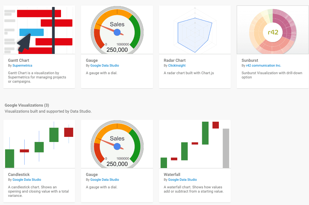
You can present your data in many formats, such as diagrams, graphs, charts, widgets, maps, and more. These models help examine business data in a way that makes sense to the stakeholders. With the help of data visualization, you can quickly solve crucial issues and manage areas of improvement simultaneously.
It’s Getting Harder To Manage Data Each Year
The world produces 2.5 quintillion bytes of data every day, and 90% of all data has been created in the last two years.
We are clearly in the era of big data.
With so much data being generated every second, it is getting increasingly harder to interpret and represent all that information. As such, data visualization comes to your rescue no matter what business you run and is, therefore, a critical tool in any effective business’s arsenal.
Organizing And Making Sense Of Your Data
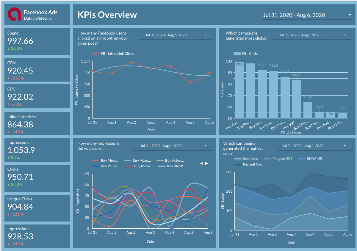
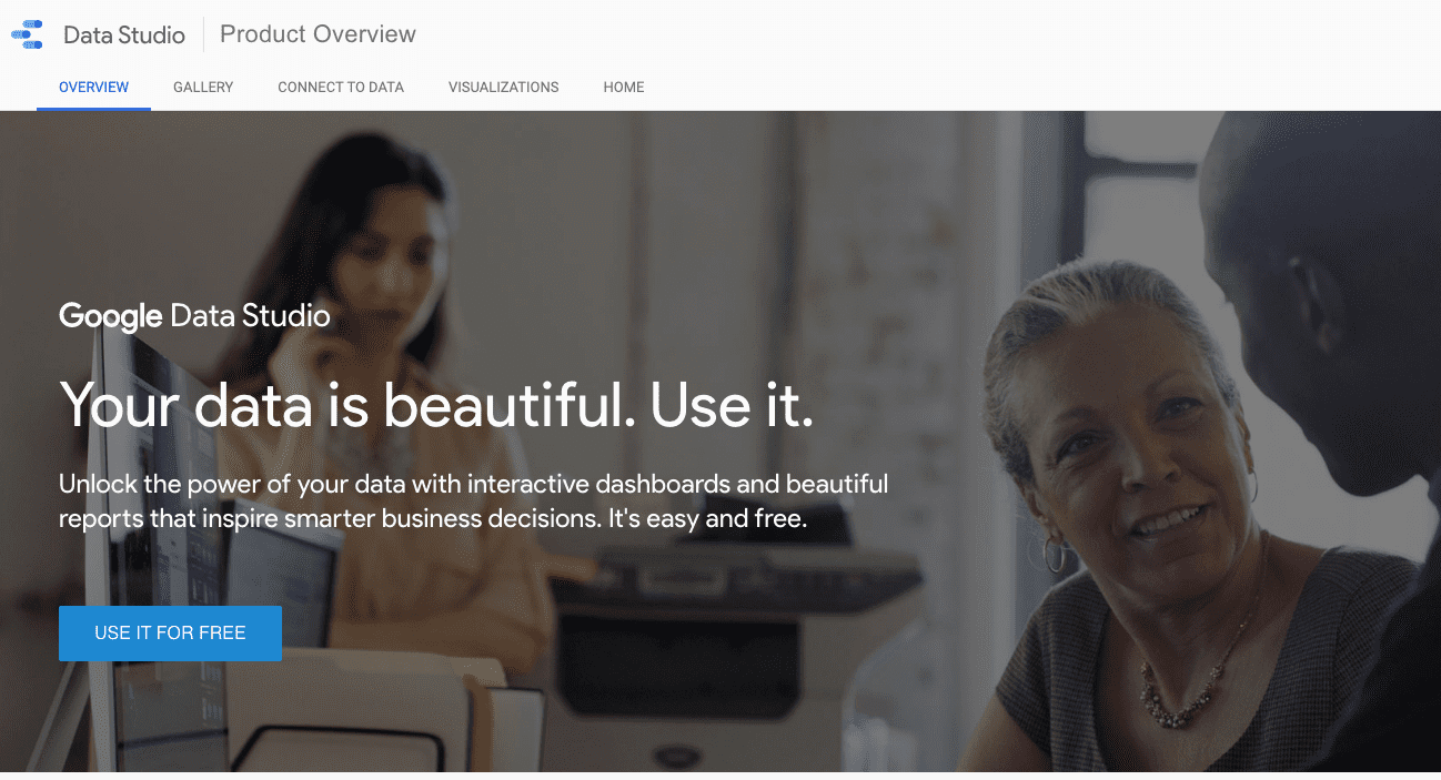
An exceptional data visualization tool to try is Google Data Studio. By pulling data from a dozen different sources such as Google Analytics, Google Ads, and YouTube, Google Studio makes it effortless to view all of that data through one image. These visual tools are dynamic, customizable, and easy-to-save and share just like a Google Doc. Best of all, Google Studio is free to use.
Some useful and powerful alternatives include:
Using Google Studio
For example, Google Data Studio has many dynamic controls to help you make your data visualization look precisely how you want it to look.
Live Data Connection
Data Studio has connections to hundreds of data sources. That allows you to simply make one data report, and it will update itself; absolutely, no scheduled refreshes needed.
Dynamic Controls
Data Studio gives you the ability to present certain parts of data however you wish without having to update the way the report is set up, similar to a Pivot Table in Microsoft Excel. You can insert dynamic controls to allow viewers to filter through the content with data range selectors and drill-downs.
Game-Changing Features of Data Visualization
Let us look at the importance of data visualization tools like Google Studio in more detail.

Helps in Analyzing Big Data
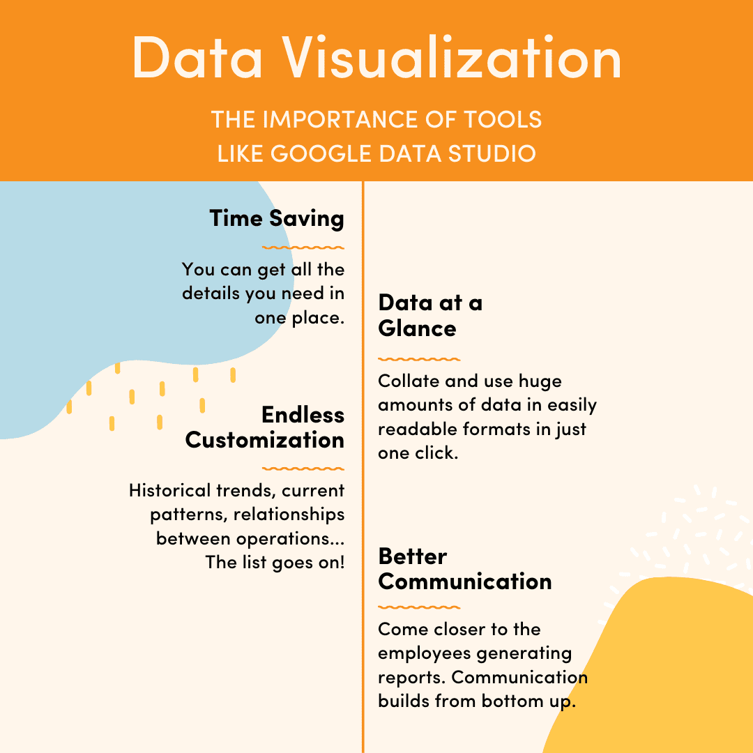
More and more companies nowadays are resorting to simply storing enormous volumes of data, making data retrieval and analysis a cumbersome job. Your team can address this issue using data visualization tools like Google Studio, which allows its users to collate and use huge amounts of data in easily readable formats in just a few clicks.
They Save a Lot of Time
Often, data retrieval takes so long that businesses decide against properly investing in it. Data Visualization is a better and more efficient way of getting all the details you need in one place, which frees up resources and creates faster, more accurate reporting.
Data at a Glance
Imagine you have two options. You either have to read an entire book before arriving at a conclusion or meaning of the story, or you can look at a representation of the story through one picture. Which one would you prefer? It makes sense to digest at a glance, rather than read the thousands or millions of rows in your data set individually.
Full of Amazing Features and Possibilities
With data visualization, you can provide every type of data, from historical trends, current patterns, relationships between different operations, and how these operations are helping create positive outcomes and results for your bottom line.
Enhances Communication Between Employees and Stakeholders
With data visualization, high-level boardroom decision-makers come closer to the actual employees generating reports. They can point out precisely what is going wrong from a bird’s eye perspective, and therefore, a channel of communication builds intuitively from the bottom up.
Data Visualization from Multiple Sources
Data visualization techniques involve using representations of data in the form of graphs, pie charts, maps, etc. With a free tool such as Google Studio or Databox, you can use all of this to represent your data in meaningful ways to your leadership or stakeholders.
These tools pull data from a multitude of sources such as:
- Google Analytics
- YouTube
- Bing
- Snapchat
- Yahoo

These tools make data synthesis easy to read and easy to share in a few clicks.
If you have ever wanted to publish your reports on your social media accounts, that is also now available with Google Data Studio. You can embed the visuals to reach larger audiences with your studies, use cases, and expert opinions.
Final Words
As the role of big data is increasing every day, the use and importance of data visualization is also on the rise.
With these tools, businesses can see the true potential of all the data they have been storing for days, months, or even years. Used correctly, information is the key that unlocks the door to the next phase of scaling your business. You can now obtain real-time data presented in such a way that it’s easier to analyze and view trends through one simple visual. That leads to better and more efficient decision-making and increased productivity, which means better outputs.
So, if your business is yet to explore the true potential of data, it’s high time you turn towards the power of data visualization.

Shalyn Dever
Shalyn is the Founder & Chief Growth Consultant at Chatter Buzz. An engineer recruited by Google, she loves solving the most complex business growth problems and utilizing technology as solutions. She loves amazing UI/UX, out of the box SEO tactics and forward thinking paid campaigns.