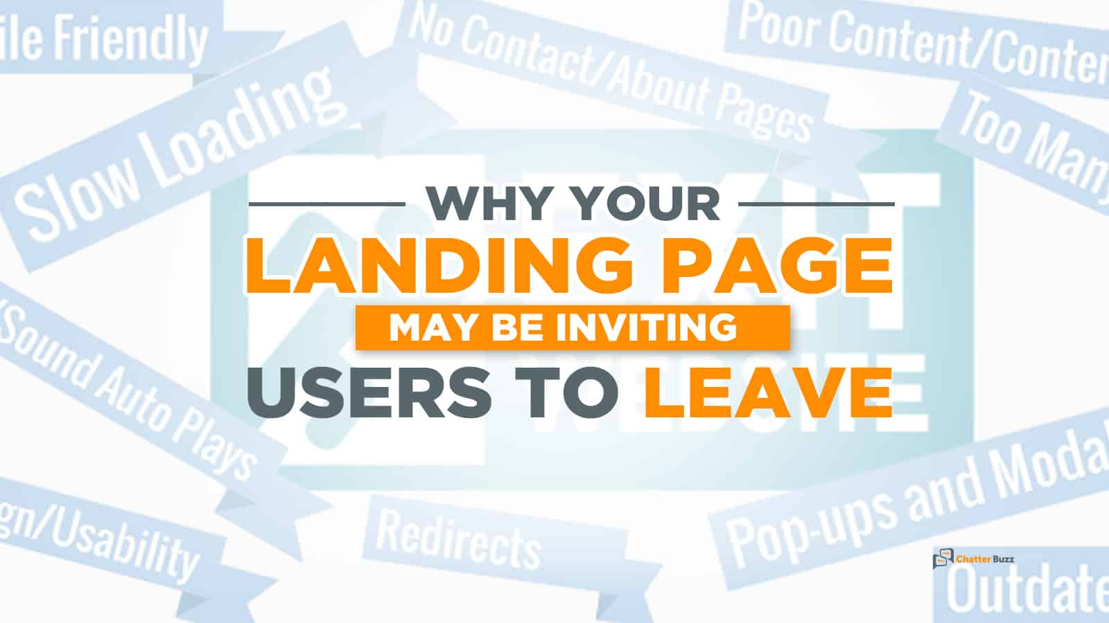
Why Your Landing Page May Be Inviting Users to Leave
Do you have an effective landing page on your site?
Your landing page is your shop window that invites people to take a good look around, take action, and – with a bit of luck – it generates leads that bring in sales.
A weak landing page, on the other hand? It invites users to leave without taking any action whatsoever.
And that’s bad news for conversions, sales, and growth. It’s also bad news for your SEO campaigns that you spent so much time and money on in order to get people onto your landing page in the first place.
Imagine if, after all that effort to generate traffic and leads, you’ve messed things up at the pivotal moment with a weak landing page? You’re essentially leaving money on the table.
It should be clear that an optimized landing page is a key to your success. That page is where people opt-in, make a purchase and otherwise engage with your brand.
It’s vital that you understand what separates a strong landing page from a weak one. Let’s take a look at a few reasons why your landing page may be inviting users to leave.
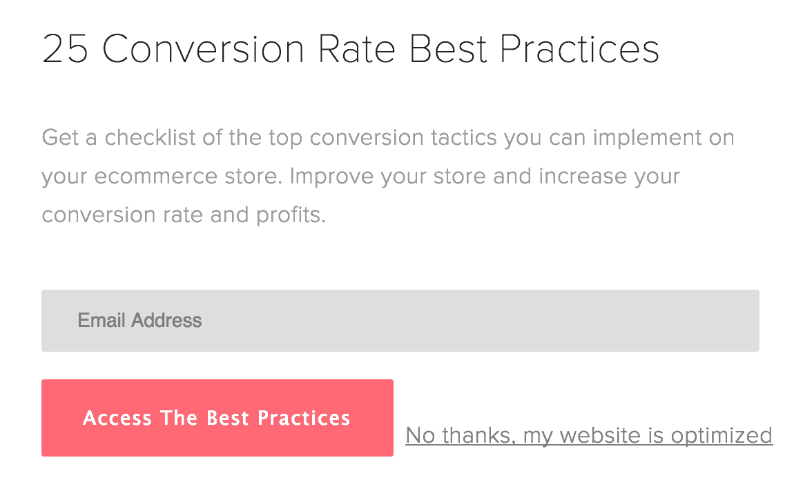
1. A Lengthy Opt-In Form
Most site visitors don’t opt-in.
In fact, conversion rates average 1-3 percent.
That’s not exactly a high number, but it demonstrates how averse people are to handing over their email address to a brand they might not have heard of five minutes ago.
People are protective of their email addresses. It’s still illegal for businesses to cold email people’s personal email addresses. That’s how intimately we see our inbox.
What can you take from this?
Essentially, people are hardly going to be convinced to sign up to something on your landing page if the form is too long, too complicated, and asks too many questions. Faced with answering everything from our date of birth to who we voted for, we’re probably going to get bored or suspicious – and make for the exit door.
So it’s up to you to split test your opt-in forms to see what works and what doesn’t. We’re not suggesting there’s a magic bullet form that works all the time. What you need to bear in mind is how you’re going to convince a user who is a tiny bit interested in your brand to give you their email.
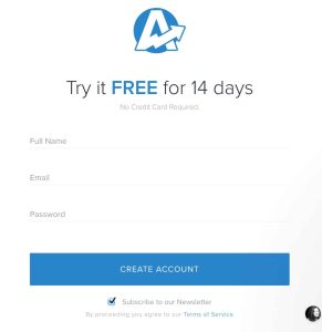
As this blog shows, the best opt-in forms keep things simple. They ask for a user’s first name, email address and – if relevant – their website.
Sometimes, a form will simply request a user’s email address. The simpler it is and the fewer questions there are, the more effective a form is.
Remember, people’s time is precious and the amount of information they’re willing to hand over at this stage is scant. All you need right now is a name and their email address. As you build a relationship with them via emails, you can then begin to learn more about them. And it’s then — and only then — that trust begins to form.
2. Making the User Too Many Offers

Some brands can’t make up their mind regarding what they want to offer their customers. They want to offer them this, that, and something else.
What happens is that the customers themselves can’t make up their minds. Distractions aren’t good for them. If you give them too many options on your landing page, they’ll be unsure of what to do. Faced with more than one option, they probably won’t decide on anything other than leaving.
It’s called the paradox of choice, and it can be really harmful to your conversions.
Imagine it: You’ve got an opt-in form all primed for your prospective customers to sign up to. But you’ve inexplicably placed a picture of a cat dancing with a dog next to it. The customer gets distracted, clicks on the image, and gets taken to a blog post.
They then forget all about filling in their details and within minutes are back on Facebook.
Your landing page must be focused on one goal – converting prospects. To this end, you need to make sure that it’s absolutely clear to each user what it is you want them to do. You don’t want them to look up there or down there or click on a link that takes them elsewhere – you want them to fill out this form and collect their gift that will add immense value to their life.
3. A Weak Headline
Landing page headlines take just a few seconds to tweak and can boost conversions by as much as 10 percent.
That makes sense when you think about it. After all, a headline is often the first thing we see when we arrive on a landing page. How many times have you been persuaded by a powerful headline that’s convinced you that your life will change today?
And how many times have you barely even noticed a landing page headline, before heading back to Facebook?
Headlines sell, and the good news is that it’s really easy to swap your weak ones for a better one.
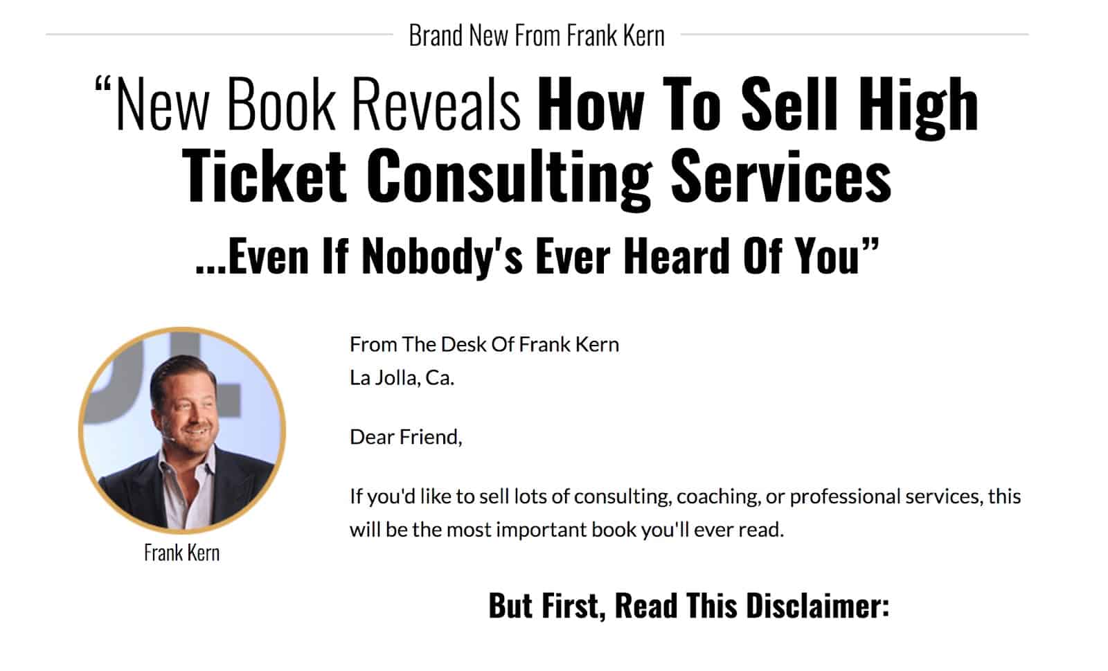
Check out what Laura Roeder did. She swapped her old headline for a testimonial from a happy customer and saw her conversion rate increase by almost 25 percent.
Social proof is super effective. If you’re not very good at crafting your own awesome, high-converting headlines from scratch, simply swap yours for a testimonial.
Example:
“I rarely opt-in to any form, but I’m so glad I opted-into this one. It literally changed my writing career.”
Of course, you don’t have to go down the route of using a testimonial as your headline. But your headline needs to be so powerfully persuasive that it convinces a prospect to take action.
A good idea is to add a verifiable number to your headline. Quantifying your results makes them more credible. Marketing Experiments found this out when they tested six headlines. The winner?
“Dental Plans for £8.33 a month. Acceptance Guaranteed.”
It was the one with the numbers in it. Why? It’s likely because numbers offer proof.
Essentially, a compelling landing page headline needs to identify the problem your customers have, as well as what they value. Then, you need to outline how you’re going to solve the problem better than anyone else. And numbers let you do this.
4. A Boring Call to Action
There are thousands – perhaps even millions – of aspiring business owners just like you who are putting together a call to action.
And among the thousands of business owners, many of them lack imagination when it comes to the text that goes on their CTAs.
You’ve seen them:
Click Here!
Submit Your Email Address
Download Now
Words are powerful things that can sway our decisions. They can inspire us to go to war for our country! And if you thought that all you needed to do with a CTA is simply tell your prospects to “Click Here” you’d be mistaken.
Happily, around 90 percent of users who enjoyed your headline will read all the way to your CTA. This means that by the time a user arrives at your call to action, they’ll already be warm. In other words, they’re interested.
Your headline has convinced them that you might have something of value to them.
They’re no longer random strangers on your site, and all you need to do is finish the job off with a compelling CTA.
If your CTA is generic and fails to speak to people? Game over. All that hard work you put in to getting them onto your page in the first place and keeping them on the page as far as the CTA will all be for nothing.
Don’t blow the last part of your sales funnel that doesn’t do justice to your persuasive copy, your standout images and your pattern disrupt headline that tore users apart emotionally. Craft a persuasive CTA that convinces users to take that all important next step by submitting their form.
There are a few things you can do to improve your call to action. Making a button is a solid option. CopyBlogger made theirs a button, and it improved their conversions by as much as 45%.
A button acts as a signifier that reminds us there is an action we can take here. By pressing this button, our life could change. Buttons arouse human’s natural instinct to be curious. It’s a psychological thing.
Imagine if you could change your life at the push of a button?
Moreover, a button makes it super clear that this your CTA. Right here is something you want users to do.
Another way to improve your CTA is to change your language. Try writing in the first person. Content Verve did, and it led to an increase in clicks of over 90 percent.
Examples of first-person CTAs:
“Start my free trial now!”
“Send me my eBook!”
“Yes, I want to make money online!”
You can see already how much more engaging these first-person examples are than the generic “submit now” lines. They actually involve the customer.
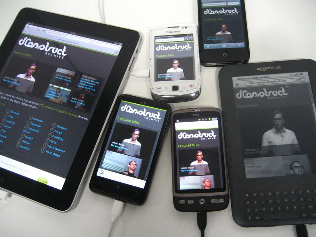
5. Your Landing Page Is Not Mobile Responsive
Millennials are here, they’re in the economy – and they’ve got smartphones.
In 2016, 18 percent of purchases made online were made with a smartphone. In the same year, mobile usage overtook desktop for the first ever time.
This tells you that you can no longer ignore the need for responsive design. If your landing page isn’t optimized for mobile, you’ll be missing out on an insane amount of customers and conversions. Your bounce rate will be so high that you’ll have to look at it between your fingers.
Effective landing pages don’t look the same on both desktop and mobile until you modify them. And until you make your page mobile friendly, your landing page might look a mess.
Fortunately, this one is super duper to fix. How you do it, though, depends on with whom you publish your site. For example, Wix users need to click the mobile phone icon at the top of their page, which lets you edit the mobile version of your landing page.
Simply follow the instructions for whoever hosts your site. It honestly won’t take more than a few minutes to solve this issue.
6. They Just Don’t Trust It
This final points ties in with what we were talking about earlier in regards to your opt-in form, your CTA, and how so many prospects simply don’t trust websites enough to subscribe and hand over their details.
The bottom line is that if people don’t trust you, they’re not going to convert.
How do you get them to trust you? All you have is your landing page. You can’t jump on a call with them, you can’t pop over to their house – all you’ve got is this one page.
Worse still, because there is no room for distractions, you’re pretty limited with what you can do, right?
Well, not exactly.
The easiest way to build trust and credibility is to include testimonials on your landing page. Testimonials are strong social proof. If including a few product reviews on a landing page increases sales of up to 20%, imagine what including testimonials as well can do.
Testimonials from previous or current customers help to put prospects’ minds at ease and give them confidence in your brand.
As well as testimonials, other ways you can build trust and credibility in the eyes of new prospects on your landing page are by addressing some of their most common concerns, such as:
* Privacy Policy
* Money-back Guarantee
* No Credit Card Needed
These simple words add credibility to your page and brand and help to put a customer’s mind to rest about doing business with you.
Conclusion: The Importance of an Effective Landing Page
The key to an effective landing page is being powerful and effective through simplicity. You need a strong headline and a compelling enough reason for people to take the action you want, but you need to keep the design and the elements clean, straightforward, and simple.
Enjoyed the post? Don’t forget to share so that effective landing pages everywhere improve!

Alijaz Fajmut
Aljaz Fajmut is an internet entrepreneur and founder of Nightwatch — a search visibility tool of the next generation. Follow him on Twitter: @aljazfajmut
Do you need someone to help you achieve your growth goals - then let us help you crush them? Let's chat!
Error: Contact form not found.
Our Experience


Testimonials
"Absolutely fantastic at putting together great digital marketing campaigns"